How imagery can make or break your business
After receiving positive feedback from my last article about visual advertising, I was asked to publish a few tips on how to improve your own photography for social media and online.
This month, we will focus on composition. There are two major rules, connected with how we perceive and see things.
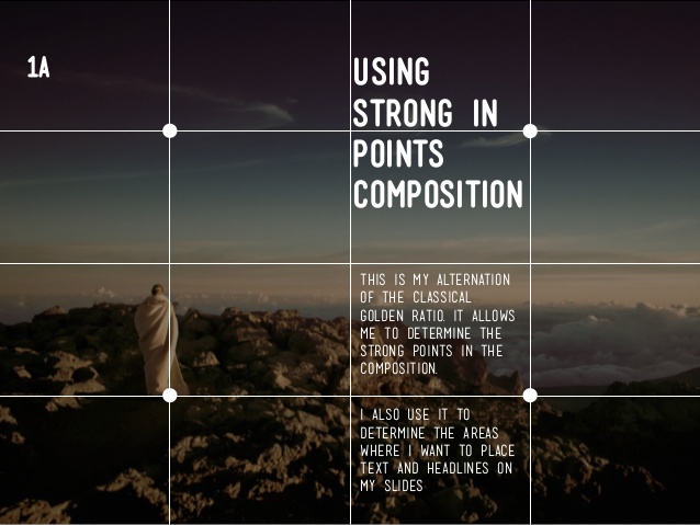
- The most important is called ‘Golden Ratio’. If you draw three identical vertical lines and three horizontal, you will divide your image into four columns and four rows. Where each line meets creating a smaller square, this shows the strongest points (each corner of small square).
These points are the ones that draw the most attention from the image. So the smartest thing to do is to compose the most important subject of your image into one of those corners, to draw your audiences attention straight to the point. It can be eyes for example or the most important section of a product you are promoting.
This way, your image becomes more noticeable straight away.

2. The RULE OF THIRD
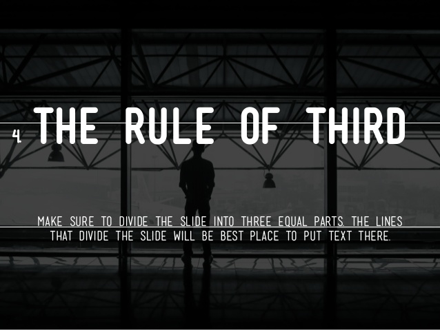
Divide your image with three identical lines horizontally. Those are the points where your horizon should be. Not in the middle. Rarely do you have super interesting both sky and land that you want to catch horizon in the middle (in term of landscape photography). You wouldn’t like to have your product perfectly in the middle either, unless you want to show perfect symmetry. Rule of third shows your audience much more interesting image, drawing attention and showing what you really wanted to ‘sell’ with your image.
You need to remember – photography is not ‘just an image’. You are showcasing your company, showing the culture of your company, and ‘background’ of your service. You wouldn’t trust a baker with poor cake images, they don’t touch your desire, so why should you try this cake. It needs to look desirable and unique, personalised. Your products matter, so does your work and so does the way you show it.
Both rules are equally crucial for portraits, landscape, commercial photography and any other visual representation. We think when we see the images, we remember them, images are embedded in our psychology. The more we know what matters for our audience, the more we can ‘manipulate’ they way our audience perceives us through the images we show them.
